8 Tips to Make Your Website Feel Like an iOS App
This is a reference for the tips from my YouTube video. If you'd prefer to watch it, check it out here:
Here are the tips:
- Tip #1: Use the Simulator
- Tip #2: Make your site a Standalone app
- Tip #3: Add a Short Name
- Tip #4: Add Icons and Splash Screens
- Tip #5: Make the Status Bar transparent
- Tip #6: Make the header fixed
- Tip #7: Disable user scaling
- Tip #8: Set the tap highlight color to transparent
Let's get right into them!
Tip 1: Use the Simulator
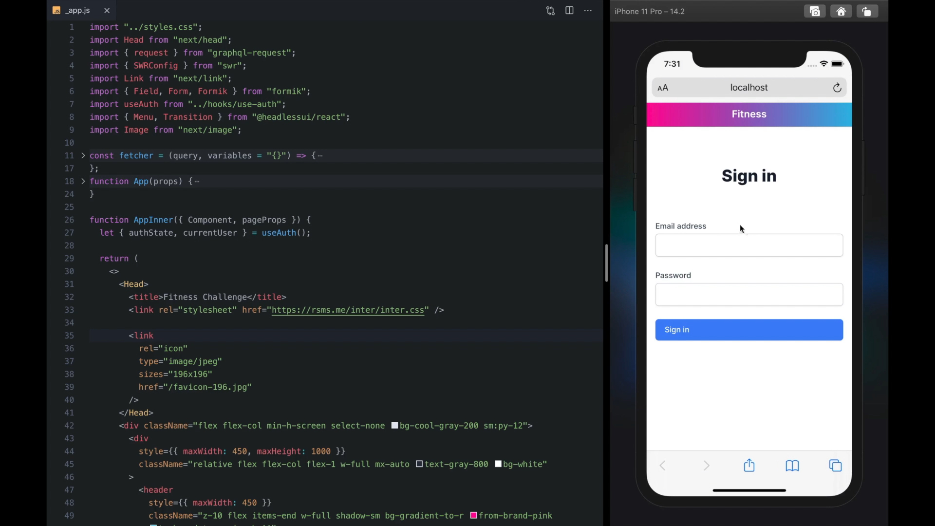
Xcode has a Simulator you can use to develop and test your web site in native iOS Safari, without having to use your device.
To use it,
- Open Xcode
- In the menu bar, click Xcode > Open Developer Tool > Simulator
You can now open Safari on the simulated iPhone and directly visit your site in development, for example via localhost:3000.
The Simulator reproduces important device-specific behavior so it's much better than using a normal browser like Chrome to test your mobile site.
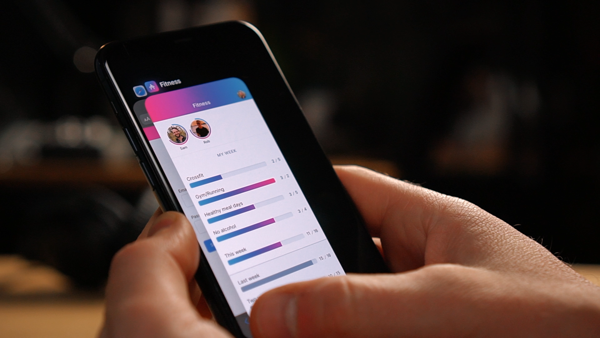
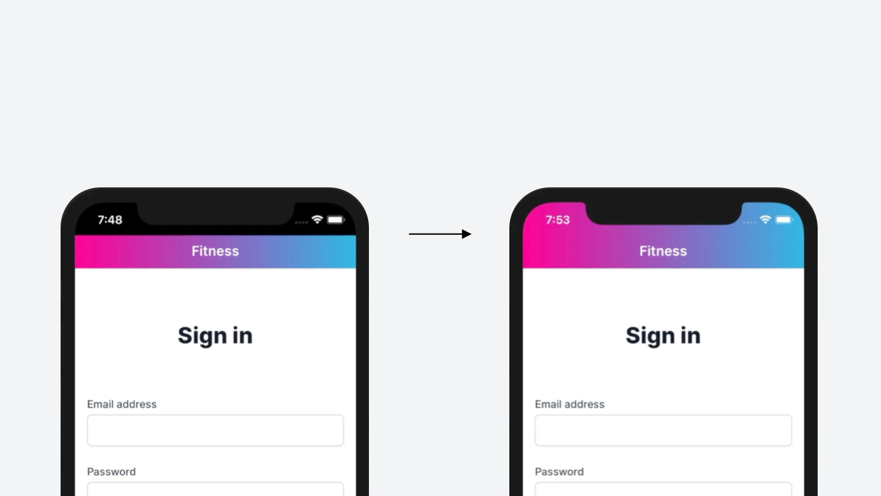
Tip 2: Make your site a Standalone app
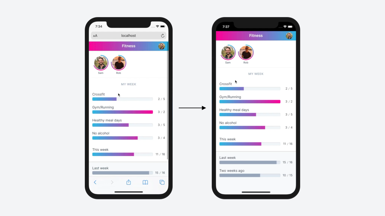
To give your app its own tab in the iPhone's App Switcher, and to hide link previews and other Safari-related UI, you need to mark your website as a Standalone app.
To do this,
Create a
site.webmanifestfile in your/publicdirectory and set the display mode to standalone:// public/site.webmanifest { "display": "standalone" }Link to your manifest file via a
<link>tag in the<head>section of your site:<link rel="manifest" href="/site.webmanifest" />
Now when your users visit your site and click Share > Add to Home Screen, they'll get a shortcut alongside their phone's other apps. Clicking this shortcut will open your site in its own dedicated app context, and disable browser-related UI like the forward and back buttons.
Tip 3: Add a Short Name
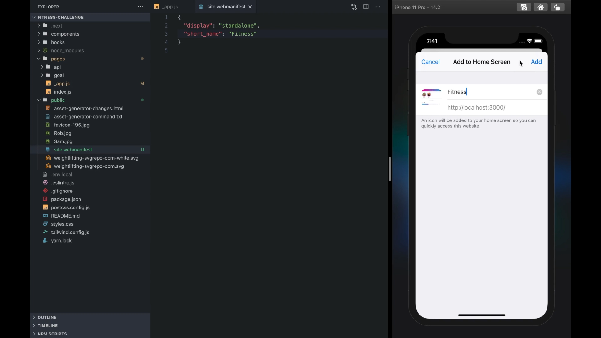
By default iOS will use your site's <title> as the label for the app shortcut created via the Add to Home Screen button. You can set a short_name property in your webmanifest file that iOS will use as the app name:
// public/site.webmanifest
{
  "display": "standalone",
  "short_name": "Fitness"
}
Now when users Add to Home Screen, they'll see this name by default.
Tip 4: Add Icons and Splash Screens
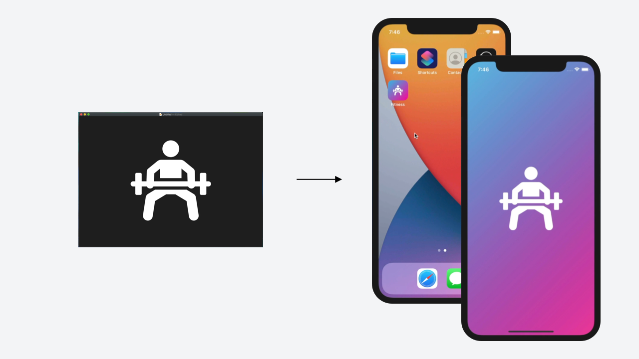
By default, iOS will use a screenshot of your website as your app's icon. Also, while your app is loading, your users will just see a white screen.
We can use the excellent pwa-asset-generator library to help us create some icons and splash screens for the various different device sizes our users might be using.
This library takes a simple SVG icon plus some CSS, and automatically generates different splash screens and icons that iOS will recognize and use for your app shortcut.
Here's the command I used (you'll need a blank public/asset-generator-changes.html file to exist first):
npx pwa-asset-generator public/weightlifting-svgrepo-com-white.svg public -m public/site.webmanifest --padding "calc(50vh - 25%) calc(50vw - 25%)" -b "linear-gradient(135deg, #2fb9e4, #ff0098)" -q 100 -i public/asset-generator-changes.html --faviconThis scrapes Apple's website for the latest device screen sizes and resolutions, and generates icons and splash screens for each one.
After the images are generated, you'll need to copy over the changes to the html file you provided to the command, and paste them into your site's <head> section.
With these new <link> tags in place, your users will now see your shiny new app icon on their honme screen, as well as a fullscreen splash image while the browser loads your site.
Tip 5: Make the Status Bar transparent
By default iOS will keep the status bar that sits on top of your website black. You can use some meta tags to make it transparent, giving you full control over the background color of your app's header.
<meta
  name="apple-mobile-web-app-status-bar-style"
  content="black-translucent"
/>

<meta name="viewport" content="initial-scale=1, viewport-fit=cover" />
Once you do this and re-add your site to the Home Screen, your site will push up against the very top of the device.
If the device has a notch (like the iPhone 11 shown in the video), the notch will obscure some of the content in your header.
To fix this, you can use the display-mode CSS media query to account for the extra space:
@media screen and (display-mode: standalone) {
  header {
    height: 88px !important;
  }
}
Bonus tip: If using Tailwind, you can add a standalone prefix by configuring the screens section of your Tailwind config:
// tailwind.config.js
module.exports = {
  theme: {
    extend: {
      screens: {
        standalone: { raw: "(display-mode: standalone)" },
      },
    },
  },
};
Now you can use the prefix directly in your HTML to adjust your app based on whether it's running in standalone mode. For example:
<header class="h-11 standalone:h-22"></header>Update: Several viewers commented that there's a better way to account for the size of the iPhone's notch in the header.
We can use CSS's env() function with the safe-area-inset-top environment variable to account for the extra height:
header {
  padding-top: env(safe-area-inset-top);
}
(Note we first remove the fixed height class h-11 from our header so the padding takes effect.)
If using Tailwind, we can add the safe-* values to our config's spacing scale
// tailwind.config.js
module.exports = {
  theme: {
    extend: {
      spacing: {
        "safe-top": "env(safe-area-inset-top)",
        "safe-bottom": "env(safe-area-inset-bottom)",
        "safe-left": "env(safe-area-inset-left)",
        "safe-right": "env(safe-area-inset-right)",
      },
    },
  },
};
and use them via the padding utilites directly on our header:
<header class="pt-safe-top">
  <!-- ... -->
</header>
So just by tweaking our strategy, we can account not only for the iPhone 11's notch, but for any device-specific shape that could potentially cut off our content.
This is definitely the better approach, so thanks to everyone who pointed it out!
Tip 6: Make the header fixed
Right now our header scrolls with our content. This feels unnatural when our site is a fullscreen app, so let's make it fixed.
<header class="fixed">
  <!-- ... -->
</header>
<main class="mt-11 pt-safe-top">
  <!-- ... -->
</main>
We also account for the extra space with some margin on our <main> tag, as well as any extra inset space using our shiny new safe-* spacing values.
Tip 7: Disable user scaling
Being able to zoom with two fingers is something users expect on websites but typically not within apps. We can disable it by updating our "viewport" meta tag with the "user-scalable=no" rule:
<meta
  name="viewport"
  content="initial-scale=1, viewport-fit=cover, user-scalable=no"
/>
You can choose to leave this one on if it makes sense for your app, but in mine I noticed we kept accidentally zooming it when navigating around, so the app felt better with it disabled.
Tip 8: Set the tap highlight color to transparent
By default iOS will highlight all link taps with a gray box, just like it does for any webpage in Safari. We can set this to tap highlight color to transparent using a vendor-prefixed CSS rule:
body {
  -webkit-tap-highlight-color: transparent;
}
Then we can use focus and hover styles to provide our users with UI feedback that better matches the look and feel of our app.
And that does it for the tips!
I find it much more satisfying to work on side projects when they feel like native apps so if you've never tried using any of these techniques before, I really recommend giving them a shot.
Hope you found that useful! Time to go impress your friends with your shiny new mobile websites 🙂