CSS Dev Conf 2014 - Notes
Here are notes from some of the sessions I attended at CSS Dev Conf 2014 earlier this year.
- Keynote
- Design the Code, not Pixel-Perfect Comps
- Modern Layouts: Getting Out of our Ruts
- A Vision for Style Guides in 2015
- Embracing Performance Optimization
- Raising a Banner for the Front-End Architect
- Let’s Get Testable
- Web components
- Layout Design Patterns
- CSS, Accessibility, and You
Keynote
Rebecca spoke about how to work through challenges in web development, drawing on some troubleshooting techniques from flying airplanes. Learning to fly involves always learning new things - just like in web development.
You can't pull over in the air, so you need to have your priorities straight when you take off. When you encounter a problem, reduce it down to its simplest possible test case. This will clarify your understanding. Making a reduced test case that fails is our single best tool for reorienting ourselves and understanding the problem we’re facing.
Some strategies to solve a problem:
- Climb. Sometimes you need to get a higher level overview of the problem. Go for a walk, step away for a bit. This is really important, but often overlooked.
- Confess. Be able to talk about what you don’t know.
- Communicate. Reach out and bounce your ideas off of others. Often a huge time saver.
- Comply. Once you've identified a new strategy, execute.
When getting ready to land, pilots sometimes encounter trouble and have to abandon their attempt. This is called a go-around: despite their best efforts, they admit failure, give up, and try again. There's nothing wrong or shameful about this; in fact, it would be foolish to plow forward in spite of all the warning signs.
As developers we need to be vigilant of this. Our judgement is often clouded by costs we've already sunk into a project. But if we step back and look at all possible scenarios, sometimes executing a go-around is the wisest move we can make.
Design the Code, not Pixel-Perfect Comps
The advertising industry was revolutionized in the 1940s when Bill Bernbach put his copy writers and designer/layout artists on the same team in order to collaborate with each other. We’re repeating the same mistakes, largely because designers and developers deliverables are different: static comps (photoshop/sketch) vs mockups (html/css). This is costly, and we sometimes end up making the same website three times. The costs usually manifest in compromised design/UX, more time, and our sanity.
Design and code should work together in harmony, from the beginning.
People say designers should learn how to code, but coders should also learn how to design. Get designers excited about dev tools, to help break down that barrier. We’re ultimately building websites, so need the constraints of the browser to shape how we think about the projects we’re building.
Case study
We tried this out on a project, and here's how it went:
- Everyone involved from Day 1. Have the back end guy talk with the content strategist. Create goals together.
- Educate the client. Show them the browser tools.
- Establish design direction.
- Coded style guide.
- Design full page. Show client the static deliverable in a browser.
- Evaluate feedback.
- Deliver design feedback via code. Interactions are design. Getting the coded version in front of the client early gets them to start thinking about things like interactions. “I’d like this to close by clicking on the background.” Normally this would be a bug, but with this process it gets handled early on. Great to get this feedback so early.
- QA, QA, QA! Coder spends more time early on (static mockups sooner, less time on PSD) so designer can start helping finesse the details in the browser (CSS animations, hover styles etc.). These are design iterations, not bugs, so it’s good to get them early.
- Build and document modular, extensible code.
- Iterate back and forth.
- Open & constant communication.
- Happy developers build future pages.
Good design == good selling
Bernbach said "Let us prove to the world that good taste, good art, and good writing can be good selling." This can apply to us, too:
Let us prove to the world that good design, good code, and good content can be good selling.
Modern Layouts: Getting Out of our Ruts
by Jen Simmons
We see the same website layout over and over again: center panel, with a sidebar:
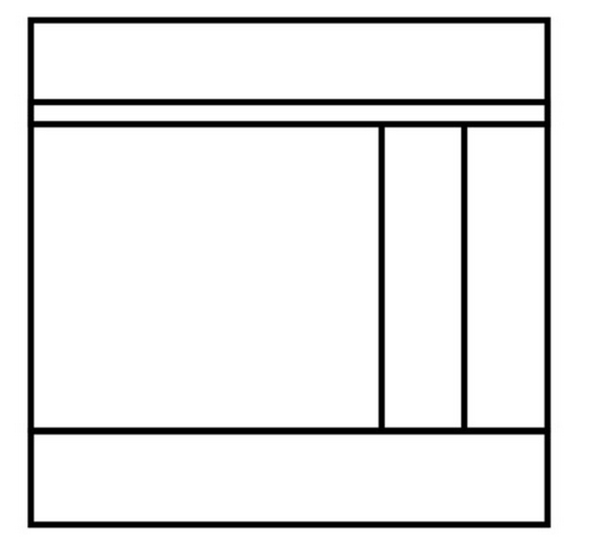
How utterly boring.
Also, users have become trained to never look at the sidebar - there are eyetracking studies that show this. So if you want to hide content, put it in a sidebar.
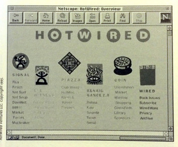
Here's a screenshot from an old "Hot Wired" website. The tops of a 6-column layout are offset slightly. It's a subtle change that has a huge visual impact:
Graphic design on the web is too formulaic: we look at other websites, see the pattern, copy it, and change it a bit. We borrow the layouts over and over. But graphic design hasn’t always been like this.
Look at Vogue magazine:

Incredible photos and layouts. The copy supports the pictures, and vice versa. There's a massive process to get the layout for the print magazine perfect - and it is gorgeous. Some of the highest quality layouts, photography and design in the world.
Now, look at vogue.com:
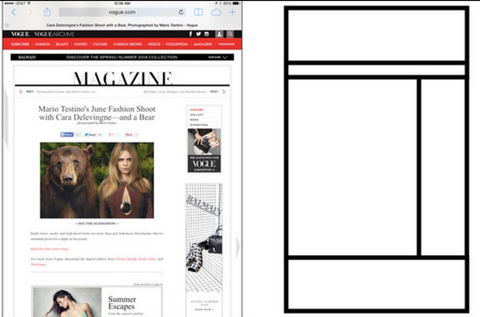
We're back to the same layout! A center panel with a sidebar. Where’s the spread? Where’s Vogue?
To help us break free from this one layout, some new APIs are coming to HTML and CSS. Let's take a look at some of them.
CSS shapes (level 1). Shapes work on floated things. You float a thing, then make a shape around it.
Viewport units. img { height: 100vh; }, or h1 { font-size: 50vh; }. That's it. vh is the viewport height, vw the viewport width (also vmin and vmax). No more worrying about setting width/height 100%, or what's inline vs block, etc.
Multi column layouts. Rules like column-count: 2; and column-gap: 2em;. But we can use column-width: 200px instead, and let the browser figure out how many columns our content needs.
Regions. From Adobe. Define ordered containers, and content reflows from one container to the next. This was in Chrome behind a feature flag, but it got pulled.
Exclusions. Something like absolute positioning plus floats.
Flexbox. Automatically makes the boxes in a row the same height based on tallest box. Check out Chris Coyier’s guide.
Grid. Simplest way to think about it is, you can stop using some third party (Susy, Singularity, etc).
Most important, don’t get stuck just transfering things from print to the web. Translate them.
The code for these new rules is actually pretty easy. What’s hard is changing our mental model about what’s possible, and what users expect in the browser.
A Vision for Style Guides in 2015
We can use style guides to document our application's styles - similar to Bootstrap's website. It's good to have our own. PDFs are better than hardcover, but hard to update and maintain, and they die too easily.
What we really want is a living style guide:
- Made with HTML/CSS
- Use production CSS
- Under version control
- Automated
Typically, we think of HTML as our content and CSS as our styling. The back end developer generates the HTML and design changes happen in CSS. But in reality, HTML and CSS are tightly coupled; they can’t live without each other. So what we really have is HTML/CSS, and our data.
Should back-end devs be copying HTML snippets? Probably not.
- Changes are hard. Version the HTML snippets? Lots of work to update.
- Edge cases. Same HTML with different amount of text, profiles that don't have images, etc.
What if we were to extract the template? In that case, the back-end dev simply has to know the template ID, and not the HTML. Essentially, we're defining an API to our style guide, with one specified “template” per action.
How can we test this? Automatically take a screenshot of each template, including edge cases. This way, we can quickly answer the most important question whenever we change the CSS: did we break anything?
Here's what this might look like. For each template, we have
- The HTML (
_user.mustache) - The CSS (
_user.scss) - Normal examples (
_user.md) - Edge cases (
_user.md+@test) - Reference screen shots (
_user-1.png,_user-2.png, etc.)
Something like this would be useful to almost everyone on your team:
- front-end devs see templates, vars, mixins
- back-end devs see data structuers
- designers see colors, fonts, edge cases
Check out Living Style Guide for more details.
Embracing Performance Optimization
by Jon Bellah
Speed should be thought of as a feature. It should be budgeted into your design.
Four pillars of perf optimization:
- Optimize the critical rendering path. HTML -> DOM, CSS -> CSSOM. But JavaScript blocks this. So in simple terms, put CSS at the top, JS at the bottom.
- Minimize redirects and round trip times. Concatenate. Image sprites.
- Leverage caching
- Reduce payload. gzip, minify. Compress and serve scaled images.
What about CSS perf?
- Browser jank. Avoid ancestors. Avoid reflows.
- Inline above-the-fold CSS
- Don’t load CSS from an asset domain
- Google guidelines. Reduce unnecessary DOM depth. Minimze CSS rules, remove unused styles. Use animations outside of the flow.
- UNCSS - remove duplicates. Also CSSCSS
- Paul Irish + CSS Tricks for learning about dev tools
- Tilt firefox plugin
Raising a Banner for the Front-End Architect
- Originally, "Webmaster" was the only role on the web. This person wore many hats.
- The ALA article “The Discipline of Content Strategy” created the Content Strategists. A new discipline was formed, along with newsletters, conferences, etc.
- “Responsive Web Design” did the same thing
There’s a new disturbance in the force. We're being told to architect our front-ends with as much care and thought as we do our back-ends. This involves:
- Coding standards: HTML/JS/CSS/Sass. Rules about how code should be written.
- Documentation. Proof that we’re following the coding standards.
- Style guide - tiny bootstraps for everyone. PhantomCSS for diffing selector-based regions
- Automation. Automate all the testing, building, etc.
- Dependency management
- Continuous Integration
and more. These myriad responsibilities have given rise to the Front-End Architect, a new and important role in the modern era of web development.
Let’s Get Testable
As JavaScript developers, we’re now making more than just "websites" - we're building applications. And we need to start thinking about application architecture.
We're learning a lot from existing back-end solutions. These ecosystems have already vetted principles like MVC, separation of concerns and testing. The front end is starting to catch up - especially in the area of testing.
There is some resistance, because it’s new and hard to understand. But it’s important, and a growing number of tools that will help us out.
Unit testing helps
- prevent regressions
- reveal who breaks things
- document your code
You need team buy-in for unit testing to work. Otherwise, you don't get any new tests, and old tests aren’t run, become broken, and become a burden or are ignored completely.
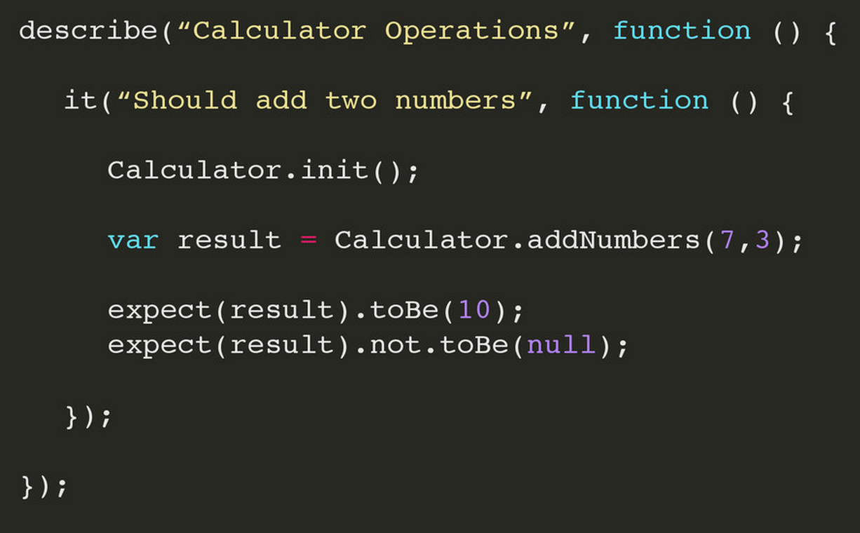
Let's test a calculator app!
- Describe your test suite (“Calculator operations”)
- Describe a function (“Should add two numbers”)
- Add an expectation (“Expect addNumbers(3, 7).toBe(10)”)
- Refactor with beforeEach/afterEach blocks
Spies report whether a function was invoked or not.
Asynchronous operations let us pause tests until some async work is complete.
If you're working on a project without tests, that's fine. Just start adding them as you build new features.
End-to-end testing tests the behavior of your app from the perspective of your users.
- Can use a real browser (Selenium, Karma)
- Can also use a headless browser (Karma, PhantomJS)
What about CSS testing?
Styling consistency: OOCSS/Modular Development. Using SASS/LESS. Pattern libraries/living style guides.
Malformed/unused CSS: CSS code styling guide, CSS Lint, UnCSS.
What about CSS Regressions?
- Visual diffs. Tools: Wraith. Resemble.js. plus PhantomCSS, CasperJS.
- This can help with RWD testing
CSS testing is the youngest aspect of front end testing today. We get to define what CSS testing means, and what we want from it.
In summary,
- Testing takes time to learn - but it'sworth it
- Test time matters
- You’ll still have bugs
- Lots of build tool integrations
- Always keep improving. We’re responsible for making it better.
Web components
by Andrew Rota
There are four main APIs that make up web components:
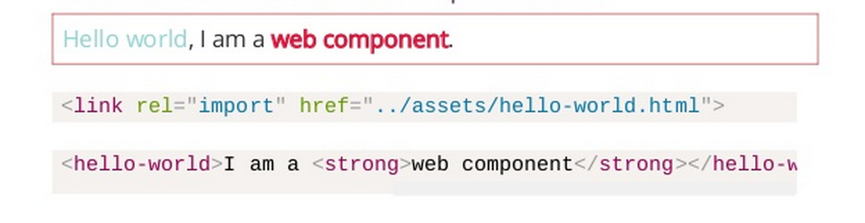
- Custom components let you make your own elements, like
<my-calendar>. - HTML Templates are a standard way of supporting templates via a
<template>tag (similar to something like Handlebars) - HTML Imports let you import web components (
<link rel=“import” href=“/imports/my-component.html”>) - Shadow DOM provides true DOM/CSS encapsulation for our components
The Shadow DOM is pretty complicated. (Note: enable “Show user agent shadow DOM” in Chrome dev tools during experimentation)
- Start by creating a shadow root on a normal DOM element
- Add styles and text to the root. They will be rendered to the browser, but isolated from the Light DOM.
- Content insertion points let you project the innerHTML of shadow DOM into the light DOM
New selectors let us cross the light/shadow DOM boundary.
From Shadow to Light
- :host { }. pseudo-class for host element. Change the width/border of the host element
- :host() { }. functional pseudo-class, for host if it matches the selector args
- :host-context() { }. for host node with parent that matches
- :content { }. selects distributed nodes rendered via a
<content>
From Light to Shadow
- ::shadow { }. pseudo-element for shadow roots
- body /deep/ p { }. combinator for selecting through shadow boundaries.
- "/deep/ is basically a super-descendant combinator"
Pulling together, we can write a simple component. The result:
Can we use this today? Stable in chrome, but not there in other browsers. Optimistic.
Polyfills include polymer and platform.js.
- HTML Imports and shadow DOM are hardest to polyfill right now.
- HTML Imports, basically just ajax
- Platform.js polyfill for shadow DOM still doesn’t hit all the cases of shadow fill
Should you web component-ize everything? Probably not. Joshua Peek, Github, says
"I don't ever see us going all in on Custom Elements for every possible thing... Use native elements and controls when possible and supplement with custom elements."
Best practices:
- Small
- Unit tested
- Open for Extension
- Accessible
- Documented
- Responsive
Layout Design Patterns
by John Ferris
Design patterns are common solutions to known problems. Turns out we have a lot of problems in CSS land. Here are some patterns you can use next time you encounter them.
- Constrained elements. Define a width to prevent an element from becoming too wide. Demo.
- Rows of relevant content. Preserve hierarchy and content relationships via rows across different screen sizes.
- Layout modifiers. Use naming convention for classes intended to modify layouts. Demo.
- Gutter pull. Pull an image outside of the grid, text flows around. Consistent gutter to call out something (e.g. book preview), no matter content side, width size, etc. Demo.
- Margin overflow. Negative margin so header is bigger than container. Demo.
- Intrinsic ratios. When aspect ratio of element is known but target size is not (e.g. embedding a YouTube video). Try max-width: 100%, but that crops the video. Instead, use known ratio. Demo.
Grids are new in web design, but they’re not new. Used in books, magazines, posters.
- Guttered grids. Demo.
- Gutterless grids, use empty columns for gutters. Demo.
- Symmetric grid.
- Asymmetric grid. Grid widths designed around the content. Demo.
- Class-based grid system. Classes like
.small-2 .large-4 columns. - Semantic grid. Classes like
.sidebar, then adding grid CSS to those existing classes.
Layouts.
- Flow layout. Elements with defined widths wrap as needed. Demo.
- Isolate layout. Can reorder our elements outside of what the markup dictates. Demo.
Christopher Alexander is an architect who pioneered user-centered design instead of platform-centered design. Wrote “A Pattern Language” and “The Timeless Way of Building.”
Design patterns are not designed - they’re observed.
Study what works in your design, and extract the patterns from those. Train yourself to observe "feel-good" code that has touched on an important abstraction. Then, make it repeatable.
CSS, Accessibility, and You
A huge design principle related to accessibility is proxmity. Things that are closely related should be grouped together on a page.
Low-vision
With this in mind, we have a problem. Multi-column interfaces are very challenging for someone with low-vision to use.
Look at this form:
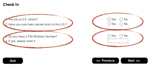
Someone with a narrow line of sight will move down along the questions and miss the inputs. A better layout:
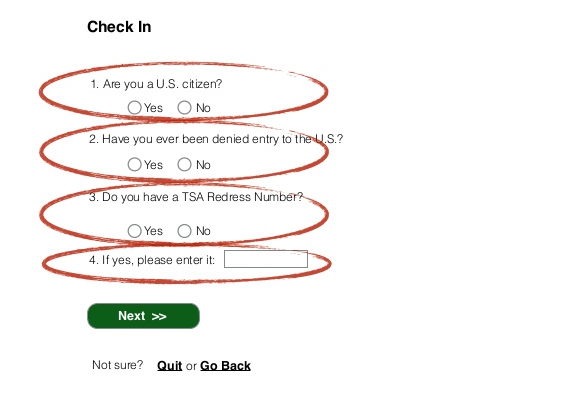
Notice how related things are grouped together. Also, the primary call to action is visually different from "back" or "quit".
Clicking on something that brings up an alert or modal off the viewport on a mobile phone - super frustrating, right? This is life all the time for someone with low vision. Need think proximity, line of site, patterns of use, and visual weight for people with low vision.
Solution: use the straw test to find layout and design challenges for people with low-vision. Scan your site looking through a straw (or making your hands into a small circle) and navigate.
More disabilities
- Blindness
- Low-vision
- Hearing
- Mobility/dexterity, fine motor, control, low-strength, single-handedness (use a growing button)
- Cognitive, attention, memory-related, literacy, routines/predictability (use a form that validates on the fly instead of returning a whole form with errors)
- Vestibular issues (unexpected animation can induce diziness/vertigo)
- Speech
Problems to be aware of
Three types of relationships:
- Explicit (
<label for='name'>...<input id='name'>) - Implicit (helper text below an input field)
- Content-based
- Explicit (
Screen reader compatible != accessibility.
Background images cause problems. Consider a "card" you can flip by hover/click
- Screen reader user vs. voice recognition user (flip vs. click to flip)
- Forget to set alt text on img. A subtle thing, but it costs people a lot of time. Takes 6 steps instead of 1.
CSS background images completely disappear in windows high contrast mode
- When CSS background images are off, what content, functionality or affordances are missing?
- Look at your apps in high contrast mode.
Look at your CSS for meaning (i.e. pseudo element used for the down arrow)
Make sure you have :focus styling. Design a high visibility focus indicator
Just because something isn’t visible on the screen doesn’t mean it’s not there.
- Elements that are off-screen need both
display: noneandaria-hidden = true
- Elements that are off-screen need both
When using generated content, what affordances are missing?
Have switches for disabling animation (carousel, parallax, etc.)
5 point diagnostic
Look for any of these in your CSS:
cursor: pointer. Instead, use a different element.outline: none. Need to design a high visibility focus indicator.:hoverwithout:focusbackground: url(...)orbackground-image. Check if you’ll lose meaning/functionality/content on high contrast.::beforeand::after